


Color Grading is a technique that modifies and enhances a select set of colors and tones compared to the rest of the image spectrum in order to make an image more appealing and invoke certain feelings in the viewer.
What Does Color Grading Mean
Color Grading process involves formulating an artistic goal of obtaining a desired final look of an image/scene, then estimating which technical steps are needed to be taken in order to achieve that look with subsequent implementation of those techniques through image/video editing.
During the color grading stage of video production an engineer along with producer and other team members chooses how to achieve a consistent art style previously agreed upon with the customer. This could be nuanced, because ultimately all stages of production should contribute to the final color-graded look, even music!

Cinematic Color Grading
Cinematic color grading is not much different in general, except that because of variation in lighting for each scene, every cut is being adjusted individually to bring them all together for a consistent final look.
“Cinematic look and feel” is typically achieved through careful planning of dramatic lighting in the original scene and is further enhanced in post-production through effects of color grading.
LUT Color Grading
The term “LUT” is an abbreviation for “Look Up Table” which means that in contrast to tweaking each color values individually by hand, a file with predetermined parameters is applied to the whole scene changing all the colors of the footage at once, resulting in a certain look that has been developed elsewhere by others. Artists and studios come up with such LUTs and sell them to clients in order for them to save on time, resources and introduce consistency throughout their project.
The 2019 Quentin Tarantino movie “Once Upon A Time In Hollywood” is a great example of modern footage that was shot and color graded in a way to give it a classic “70s vibe” look and feel.
Color Grading vs Color Correction
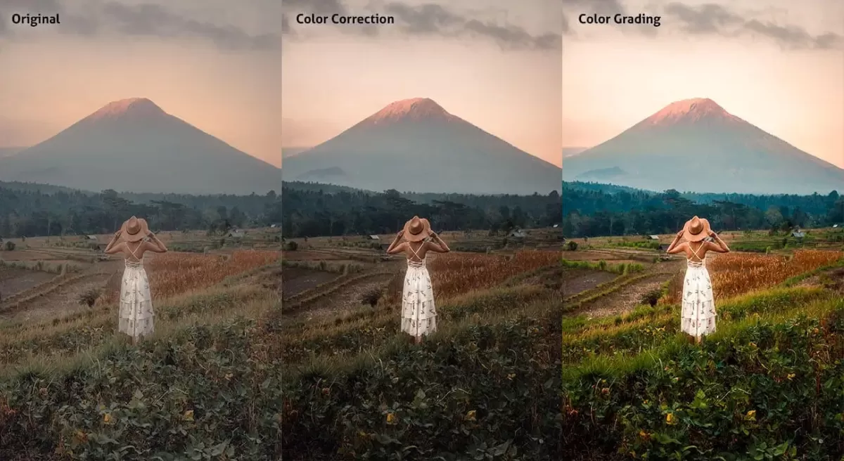
Color correction is a vital first step right after obtaining raw footage and preparing it for editing. All the cuts have to conform to a standard of rendering that the project team aims for. This means adjusting white balance, exposure, contrast, highlights and shadows levels and other secondary parameters in order to bring in realism and believability. Only then can the color grading process be started, which will bring the image to life, so to speak and make it truly stand out.
Here you can compare two versions of the same frame: before and after color grading is applied. You can clearly see the emphasis on a certain color palette in the final shot, which is more vibrant and atmospheric.
Color Grading in Animation
Although modern animation is almost always fully 3D-rendered and doesn’t contain real-world scenes (exceptions apply), the process of color grading is still required because workflow involves various 3D packages producing parts of the final product each in different color space.
Color Grading, Emotion, and Genre
Color is one of the fastest ways a film or video communicates with its audience — viewers register the emotional register of a color palette before they consciously process the narrative. This is why color grading decisions are never arbitrary.
- Warm tones (amber, orange, golden) signal comfort, nostalgia, and intimacy. They are common in romantic films, lifestyle brand videos, and scenes designed to feel welcoming or familiar.
- Cool tones (blue, teal, grey) suggest detachment, tension, or clinical precision. Action films and thrillers frequently push footage into cooler territory, especially in high-stakes or confrontational scenes.
- Desaturated or muted palettes communicate realism, severity, or moral ambiguity — a visual cue that the story is not offering easy answers.
- High-contrast grades (deep shadows, bright highlights) are associated with drama and danger, while soft, low-contrast looks feel approachable and human.
The choice of color grade is, in effect, a brand decision — and it should be made with the same deliberateness as any other visual identity choice.
Where Color Grading Sits in the Production Workflow
Color grading is always a post-production step, but the decisions that make it possible are made much earlier. A brief overview of where it sits:
Pre-production — The director, DoP, and colorist (if engaged early) agree on a target look. This may involve creating a mood board, selecting reference films, or building a test LUT to guide on-set lighting decisions.
Production — Footage is shot in a flat, low-contrast log format (such as S-Log, C-Log, or ARRI LogC), which preserves the maximum amount of image data for the colorist to work with later. Shooting log intentionally produces footage that looks washed-out and grey on set — this is correct.
Post-production (color correction) — Raw footage is balanced to a neutral standard: white balance corrected, exposure normalized, inconsistencies between shots resolved.
Post-production (color grading) — The creative grade is applied. The colorist shapes the final look, applying the agreed visual language across every scene.
Delivery — The graded master is exported in the required color space and format for each distribution platform (cinema, broadcast, web, social media), as each has different technical specifications.
Select the video type that aligns with your marketing objectives, and receive an immediate high-level estimate of the production cost.
